Yes! Advertising on Google and Facebook is one of the fastest ways to drive brand awareness. As well as drive traffic to your website or social media pages and get customers purchasing. And you’ve asked your team to do just that – to at least get the ball rolling to drive visitors to your website. And the team is gushing with results of excellent CTR’s (Click Through Rate), but the same excitement does not reflect on your website.
Your website visitors are far and few and bounce rates are ranging in the 80 – 90%. Well, this means prospective customers are seeing your ad, clicking on it (assuming they’re interested), and then not waiting for more than 3 secs on your website! What’s wrong? Your ads are getting a high CTR but no or low conversions! Maybe you need the experts at Mindstorm to help you and we would be happy to.
How about we look at some common marketing mistakes that marketers make while setting up ads causing this unfortunate yet common digital marketing issue.
1) What does your ad look like?
Yes, what does your Google ad look like? One of the common marketing mistakes is not evaluating your ad design critically. Not color, design and contrast, but the ad copy and its intended user designed for. You must understand that users behave differently on different platforms. While they may browse social channels, on Google they are here for a specific search and purpose. So, unless your brand aligns with that purpose, your ad mustn’t be viewed by that user. So, your social media ads could focus on better confidence with better hair using a hair oil. It can then take the user to your page for a full user experience. However, your Google Ads must have a strong headline and strong copy. It must drive home the message of a hair oil for hair loss, or thinning hair or greying hair. If you’re running PPC campaigns, use relevant ad extensions that will drive high CTR and high conversions.
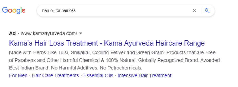
Look at the ad extensions on the bottom. Historically, men suffer from balding patterns, so the ad targets men, and the extensions focus on hair treatments. The ad could also be targeted to women who are concerned about the hair loss of men in their lives. On clicking the ad, it takes you to their e-commerce website on hair loss and thinning web page.
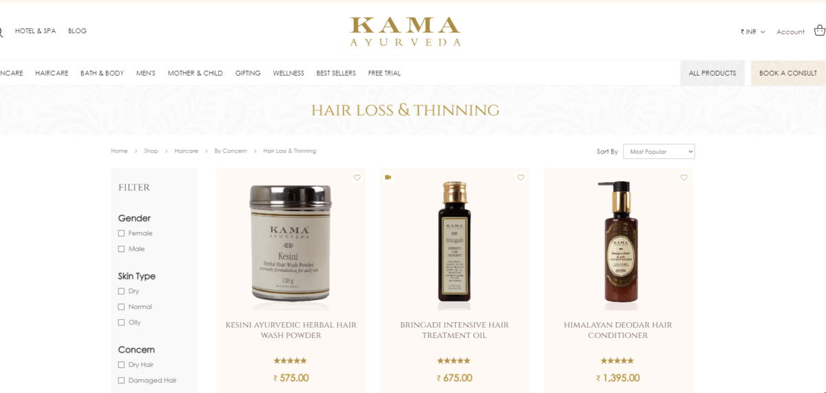
There is a high possibility that a user who is aware of the brand continues to browse the products and makes a purchase too. For a new user however, an instant direction to BUY something may cause them to drop out of the page. Thus, the brand should ensure that a new user lands on a page with more information about the use, benefits of their products and hair treatments. Then guide them to BUY. If the user buys, you’ve achieved your conversion. If the user doesn’t buy but stays on to read for more than 1 minute, you’ve achieved a prospective customer.
This means where the user lands will define your conversion too.
2) What does your Landing Page look like?
It’s all different!
One of the most common marketing mistakes that cause a high CTR but low conversions is a mismatch between your ad copy and your landing page. It’s all different. Let’s take an example, a user searched Nike Shoes and ad talks about buying branded shoes at low prices.
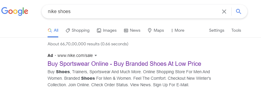
Here is the landing page the user is directed to. Not a sale page, but the website’s index page.
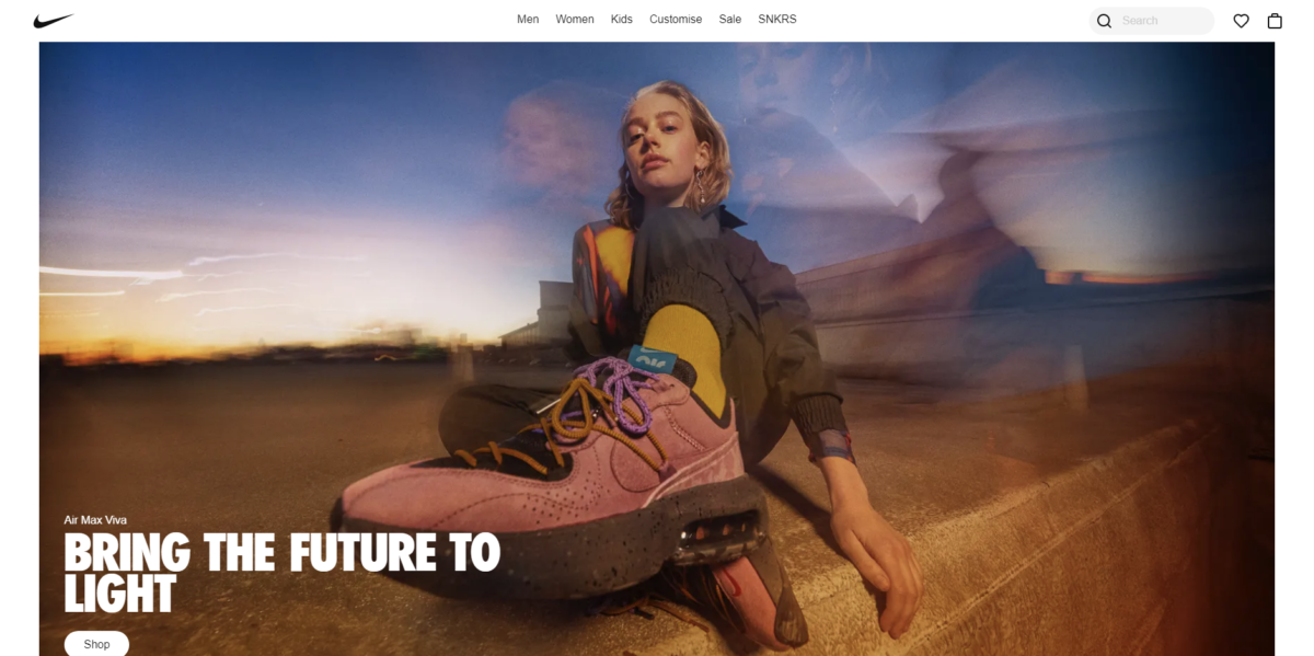
A user searching for Nike shoes is likely to make a purchase looking at the ad copy. Since it clearly says buy at low prices and the link extension says SALE. However, landing on an index page, means the user will have to go on a hunt to look for the Sale. High chances of a low conversion. However, let’s look at this ad for the same search. The headline clearly states new stock and Nike online collection.

The landing page directly takes the user to the Nike Collection on the website. This means high CTR and high conversions.
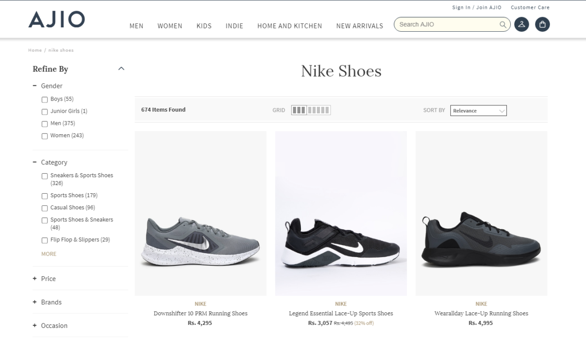
Redirecting users clicking through your ad to the wrong page, i.e., your homepage is a more common marketing mistake than you think. Some users will consider looking for the Sale page, most visitors simply drop off the site. There you go – high CTR but low conversion!
Landing page design
Your landing page design matters too. Not only the colors and fonts, but meaningful layout and content too. The budgets spent on garnering high CTR is also high. So it would be smart to ensure you’re delivering relevant content in the right context. Cramming up everything – from sign up forms to pop up ads, details of your brand, product performance is irritating to the user. Let your landing page get to the point and your user ease into the landing page.
Take a look at this Instagram Conversion Ad for sauces. It has good ad design that takes the user to a short description about what the sauces do for your food. The landing page then graduates on to the exact same product on sale. In this case, if the user wasn’t looking for sauces and still clicked the ad, chances are they just spend more time browsing the website. And if the user clicked with intent, expect a conversion on the site immediately. Yes, they can do better on the load time of the images.
Bringing us to speed of the landing page
Everything today is almost instant! Did you know 40% of people abandon a website that takes more than 3 seconds to load? And that a 1-second delay in page response can result in a 7% reduction in conversions?
Now imagine that! So many visitors clicking through on your ad only to find the website or landing page taking too long to load. Before you can assign a landing, page check the speed of it on Page Speed Insights, a free tool from Google.

And yes, don’t forget to optimize your landing page for mobile. There are 5.22 billion unique mobile phone users in the world today. 77 percent of the world’s internet users buy something online each month, with more people now making purchases via mobile devices than via desktop and laptop computers. The chances of low conversions get even higher with low load times on mobile phones. Consumers are glued to their phones, probably why shopping apps are thriving today. They do not want to lose customers to poor load times and poor internet connections.
From speed to design and an ease to access, if you’re running ads, you cannot afford to overlook the technical and marketing aspects of a good landing page.
3) Where’s the CTA (Call to Action)?
Well, it is the most important part of your ad and the consequence of it is a bounce or a low conversion rate. When you put out an ad on Google or Facebook, it often goes out to a larger audience who doesn’t know your brand. Your CTA needs to give them a chance to learn more, especially when they click on it and come to your landing page. Asking for an immediate action in the first panel of your landing page would cause an immediate drop from your site. You need to understand how to use Facebook conversion ads and how they work. Users on the top of the funnel need more time investment to convert, than just ‘Buy Now’. Your landing page needs to clearly create the need to purchase. Let’s take this Instagram conversion ad – also a lead ad; conversion rate in this case would be the number of leads who subscribed. The ad differentiates between the cost of clean water per month. The Call To Action is- SUBSCRIBE.

On clicking the CTA, here’s the landing page. – SIGN UP FOR 7 DAYS TRIAL. It’s a great lead magnet.
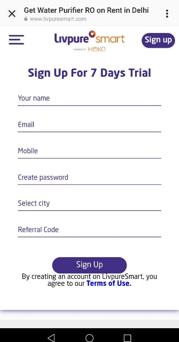
However, the CTA ‘Subscribe’ may confuse the user as to what it is they are signing up for. The user needs more information on this subscription concept. The landing page needs more information as to how the 7-Day Trial would go. And that it is a rental trial of an RO water purifying unit, not some kind of EMI scheme.
The user may already have a water purifier, or may not be consuming water through a water can. Since determining these factors are difficult, an immediate sign-up form may cause high click through rates, but low conversions. Thus, lesser leads generated. Generating leads for businesses comes down to method! And it is key to understand how to create an effective lead generation strategy for your business rather than just run ads blindly.
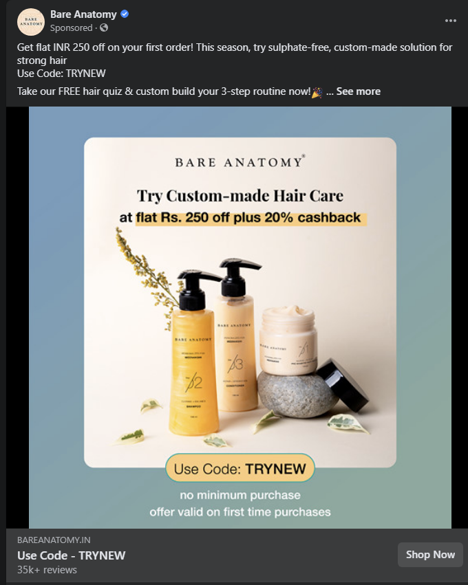
On the other hand, let’s look at this Facebook Conversion ad of a shampoo brand that customizes shampoo as per the user requirement. The CTA is clear use code, get discounts and shop now. However, since the concept of a customized shampoo is relatively new, a direct buy from a new user is farfetched.
It then guides the user to a landing page on their website, where the first panel itself explains how to use the product with a quick hair analysis. The rest of the website also explains how you can customize your hair care regime.
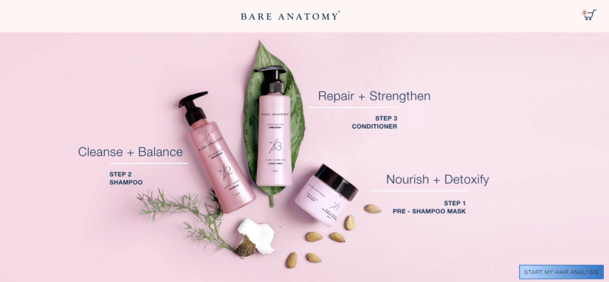
It’s a different way to buying regular hair care products. The landing page educates the user and keeps them hooked on how to create a custom hair care regime.
4) Keyword Research is crucial
Another common digital marketing mistake is so basic, that several marketers ignore it. Thorough keyword research is crucial to driving conversions. Simply choosing high-volume keywords and phrases just because they’re popular usually results in high click through rates, but low conversions. Take for example the below ad for a search of Study Abroad in New York. This is a political ad and has nothing to do with studying abroad and is of no interest to the user. All clicks through this search is a wasted expense and loss of budget. If the user is keen on looking up courses, he might even click on this link, only to bounce off the website immediately.

and long tail keywords in your ad campaigns. It is not only a search volume game. Marketers must focus on keywords that best describe your brand and watch what websites usually come through for each keyword. Also consider using negative keywords for your ads to ensure that your ad doesn’t feature along here. New York being the hub of several Ivy League universities, this brand could have considered using ‘Study Abroad’ as a negative keyword. That way this particular ad would have never featured to a user looking to study in New York.
5) Have you considered retargeting?
So, the user bounced off the website, but a click meant a user was interested momentarily and did visit your website. Plan a detailed and interesting retargeting strategy to guide these users back to your website. Yes, retargeting lets you show your ads back again to users who visited your website. You can even retarget ads to users who created a cart and dropped off. But this time, give them a lead magnet like a discount to purchase your product.

Retargeted ads act as reminders and push the consumer to take action on your website. The extra offers also encourage them to purchase, thus increasing the conversions on your website.
High CTR, low conversion is a common digital marketing conundrum. The above few points are for you to understand the reason for low conversion rates. These are basic hygiene points that marketers need to remember while planning their digital ad campaigns. However, if PPC campaigns are part of your go-to-market strategy, we recommend taking help from experts in digital advertising. We’d love to help your brand and website grow. Come listen to our own success stories of how digital advertising has helped improve conversions for some of our clients. Let’s chat more about how we can make this happen for you, give us a shout at aniketh@mindstorm.in.
