In a highly competitive market, having a website that simply represents your company’s prospectus, may not suffice. A well-planned website is crucial for the success of a business. The content you put on your website will be the deciding factor for whether or not a user is interested in making a purchase. It will influence their purchasing decisions, create a virtual territory for discussions, and encourage your prospective customers to convert. Moreover, if you are an eCommerce business, it becomes even more important to focus on the UI/UX along with the content of your website.
A good UI/UX will help build a sound customer experience and spark satisfaction with your website, ultimately maximizing conversions. Hence, it’s inevitable to cultivate a user journey on your website that makes interaction with the website effortless, delightful, and catchy. As a matter of fact, estimates suggest that it only takes visitors 50 milliseconds to form an opinion about your website. While researchers have also found, 46.1% of people say a website’s design is the top criteria for deciding if a company is credible or not. The statistics are further highlighting the importance of a well-crafted professional website in the virtual market.
Not just it, you cannot underestimate the aesthetics of your website when thinking about conversion rate optimization. If given 15 minutes to consume content, two-thirds of people would rather read something beautifully designed than something ordinary. Nearly 40 percent of people will stop engaging with a website if the content/layout is unattractive. Isn’t it too much of a sacrifice just because of unattractive design? Do not confuse redesigning your website, as only changing color/ adding images. The sole purpose of design is problem-solving, so keep in mind that your website should be able to provide customers with what they are looking for and is aesthetically pleasing at the same time.
Before we begin with the dos and don’ts of redesigning a website, answer these questions to check if your website needs redesigning;
- Are you receiving complaints about user experience/ witnessing an increase in bounce rates?
- Does your website have a design-related problem/ is out-fashioned?
- Is your website missing any information that might impact buying decisions of your prospective customers?
- Are your conversions and sales rate decreasing?
- Is your website taking too long to load/ is not optimized for multiple devices?
If you answered any of the above questions as yes, your website needs redesigning!
Seeking professional assistance to help you rebuild your website that converts? We at Mindstorm, help businesses with Web Development and Web Design, by employing a strategic approach and in-depth analysis of KPI’s, to generate maximum ROI. Feel free to contact us at ANIKETH@MINDSTORM.IN for more information!
To begin with, we have gathered some applicable information, tips, and tricks for you to help you rebuild your website to improve conversions and sales. Let’s delve deeper into it!
Ensure Your website loads in time!
A study by HubSpot says; “The first five seconds of page-load time have the highest impact on conversion rates. Website conversion rates drop by an average of 4.42% with each additional second of load time”. You do not want to lose a lead, even before showcasing your products/ services/ portfolio. So, delayed load time can impact your business extensively. Make sure you troubleshoot issues if any and regularly keep an eye on your website load time. You can use the following tools to check your websites;
- Google PageSpeed Insights
- Pingdom Tools
- WebPageTest
- GTmetrix
- Sucuri Load Time Tester etc…
With the effective use of these tools, you will be able to identify any key issues and optimize your website accordingly.
Make Effective use of White Spaces!
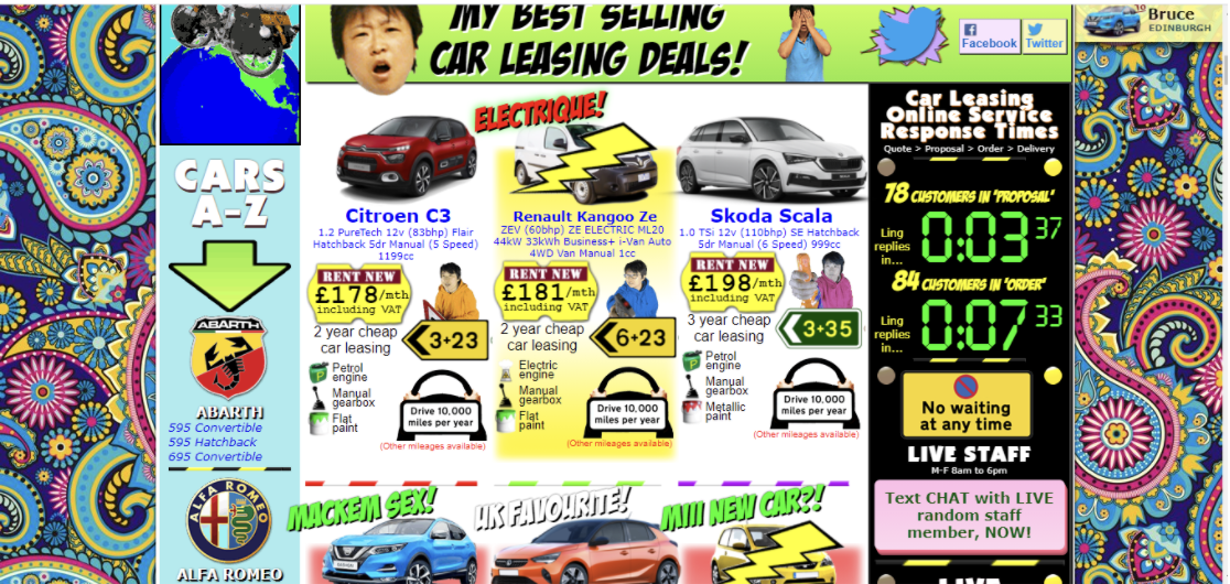
White spaces, also known as negative spaces, concern the space left between elements of the composition of websites; like graphics, margins, or gutters. These unmarked spaces are the fundamental core of a website design and make a huge difference in website conversion rate. The idea behind leaving the negative space is to drive the user’s attention to call-to-action rather than other elements. Google’s search engine is the best example of effective use of white spaces!
Which of the following websites are you more likely to interact with for a longer duration of time?
A.
OR
B.
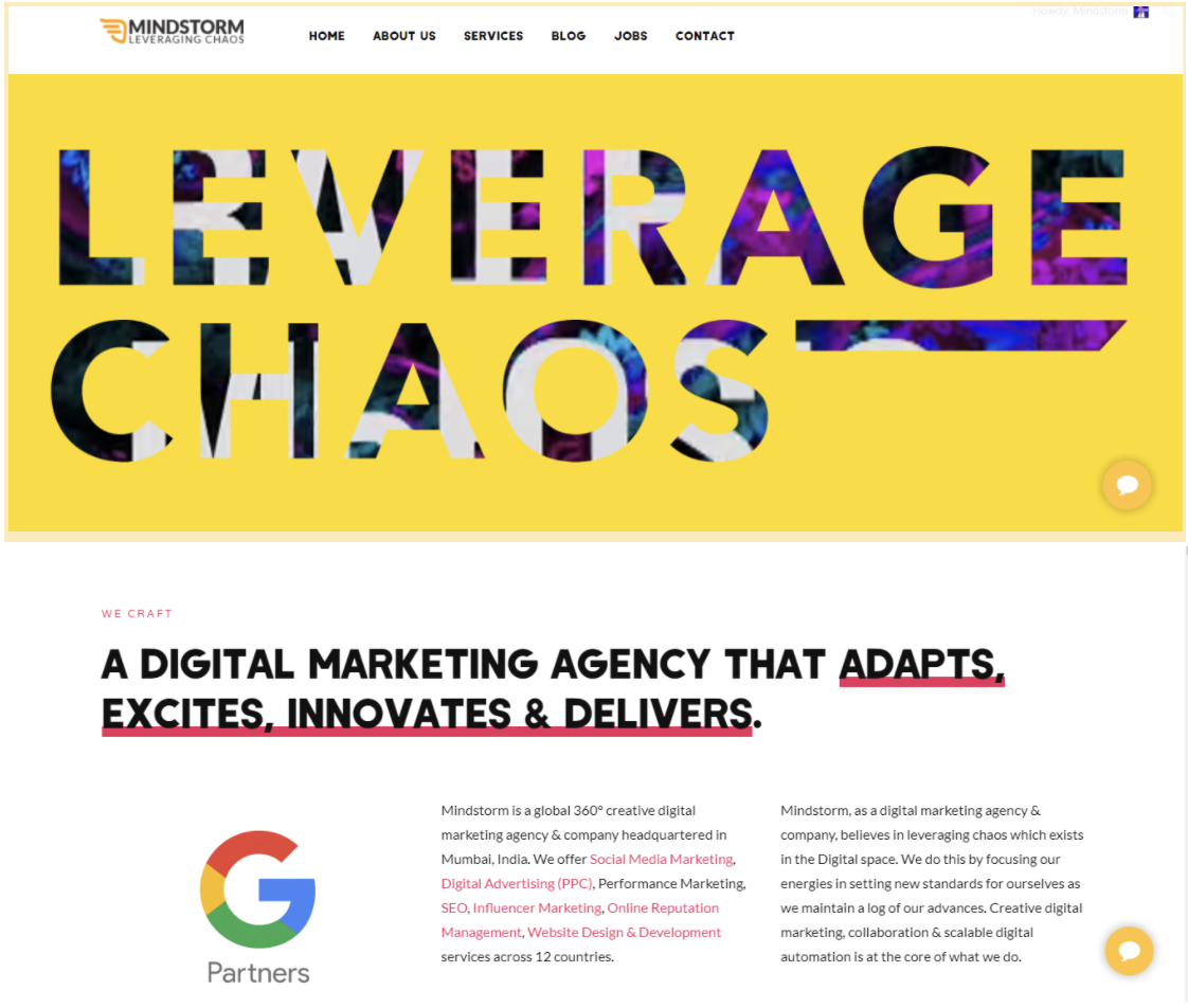
Well, it is probably option B. A well-structured website is equivalent to an impressive website. Meaning it will attract more visitors, interact better, and enhance the user experience. Ensure you are adding white spaces between larger elements, aligning text correctly, making use of margins and padding, to make your website look neat and clean.
Make your website visually appealing!
Visual appeal is the deciding factor for how people will perceive your website. It’s the form of visual communication that will help your prospective customers decide whether or not to use your website and how they remember it. There are various elements to consider, like; color schemes, images, fonts, and overall balance between these elements.
- Colors
A visually-appealing website begins with a color scheme of the website. Colors have a psychological impact on the viewer, as every color portrays a different meaning. Ensure you choose colors that effectively convey the message you wish to communicate to your audience.
- Images
Images are the most important visual element that determines the quality and value of your message put across the website. A study found that 60 percent of consumers are willing to consider search results that include images and another 23 percent are more likely to contact a business showcasing an image. So, you might lose a potential customer if your website is not making use of images.
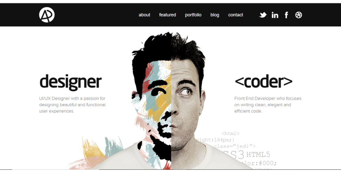
You can find high-quality images on websites like; Unsplash, Pexel, Negative Space, Picjumbo, and more. Also, using human faces for your website will help your visitors empathize and build connections with your website. Below is an example of including images on the website;
While you put images, make sure images aren’t taking too much time to load. Optimize your images before putting them on your website. Optimization compresses images without affecting the quality of the image. Tools like Tiny PNG, Optimizilla, Compress Image, etc. can be helpful.
Other visual elements that you can consider adding to your website include; infographics, gifs, product demonstration videos, client portfolio, media mentions, and many more..
Check the Usability of your website!
To drive a better user experience on your website, it’s inevitable to evaluate the usability of your website. In other words, usability helps in determining how easily your website interacts with its visitors. Here are some of the things to focus on to check the usability of a website;
- Site Navigation:
The clearer and smoother your site navigation is, the happier your user experience will be. Do not overstuff your website’s navigation bar with too many elements. It will cause confusion and users might end up selecting none of them. The more options you offer, the lesser will be the chances of visitors clicking on any of the options. Only keep the most important ones on your navigation bar.
- Guidance and Relevant Information:
Do not expect your users to explore the website to learn about your services without some guidance. When designing your website, consider putting the most valuable information on the top that might arouse interest and provide users with a good first impression of you. Once a user lands on a company’s homepage, 86% of visitors want to see information about that company’s products/services. Moreover; 64% of visitors want to see the company’s contact information and 52% want to see “about us” info.
When redesigning your website make efficient use of CTA’s, contact forms, live bots, and other such tools that make user interaction easy. Also, don’t miss out on sharing relevant information – it helps guide your customers while establishing the credibility of your website. People tend to trust your website more and piques more interest if details are up-to-date and contain all the expected information.
- Responsiveness
Responsive web design means your website should automatically adjust according to user preferences, based on platform, devices, screen size, etc. Meaning if a user switches from laptop to mobile or iPad, your website design should be compatible and respond within seconds. 47% of Users expect a maximum of 2 seconds loading time for an average website, while 85% of website visitors expect the mobile version of the website to be faster. A website’s usability is dependent on the ease of use by visitors, thus it’s important to consider these factors and design a website that meets customer expectations.
F-Layout for creating visual hierarchy!
Researchers have provided a useful eye-tracking resource, known as F-pattern. It is the natural eye flow of a user while reading content on a webpage. Here is a heatmap with wireframing, to help you understand how users look at the information on webpages.
You can take advantage of this user behavior by placing the most valuable information on the top and higher visibility areas, namely 1,2,3,4 as pointed out in the image. For instance, you may consider adding main headlines/CTA’s on the top left corner where visitors will look first. You may use a heatmap in order to identify the eye flow of your website and check where are users looking at your website.
Evolutionary Site Redesign
Redesigning a website involves various risks and might not always be proven helpful to increase conversions and sales. The traditional website redesign involves periodical redesigning and doesn’t consider risk mitigation. On the contrary, Evolutionary Site Redesign is a newer approach towards website redesign. It involves continuous improvements and developments in website design while determining what works and what doesn’t works best for your website.
ESR involves a strategic A/B split testing that is helpful in accomplishing brand objectives and simultaneously catering to the expectations of the visitors. Evolutionary Site Redesign is a way forward for the brands in accordance with achieving business objectives, generating leads, and increasing conversions!
These are a few tips on making a website redesign successful. Put these tips to good use but, make sure you analyze existing KPIs, design elements of your website and then implement a new strategy accordingly. Feel free to connect with us at ANIKETH@MINDSTORM.IN for professional assistance! Our team is committed to providing you with the best results through deep analysis and sound planning. Our Web Development and Web Design services have helped businesses generate optimum ROI and we’d be delighted to help you too! Cheers!

